the life of a css project
People often ask me to summarize the dangers and pitfalls of a css project. If you've been writing css for some time you'll know there are quite a few, many of which are difficult to explain to people not familiar with actual css code. Composing textual summaries is simply too boring and technical for most people to really care about. So I'm gonna try something different today.
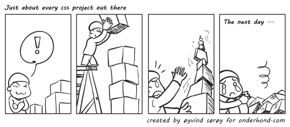
Below is a little 4-panel comic that illustrates what happens with just about every css project over a certain stretch of time. I came up with the idea, sadly drawing isn't really my strong point. The actual drawing was made by Øyvind Sørøy (thanks again!), the man who was also kind enough to create the initial design for my blog and the IE6 CSS Fixer graphic. It turned out wonderfully well, so enjoy the following 4 panels of css wisdom.

a quick tour around the 4 panel
While the comic pretty much speaks for itself, I'm going to elaborate a little on the third panel which contains the essence of this comic.
When a css project is "finished" we are often afraid to dive back in and change stuff, because we've forgotten why half of the statements are in there and how they effect components across several pages. Many of the css files out there contain absolutely useless statements simply because "it worked any nobody dared to tweak it anymore". Just do some random probing on websites and you'll find an excessive amount of properties that are remnants of failed css experiments. They won't affect the current design, but might affect future changes. These statements are sure to come back and haunt you at a later time.
The final delivery of a css file is often met with an unhealthy amount of fear. By then the css is often unstable and untrustworthy, but "works" for the delivered design and html. Most of us just hope that there won't be any feedback and we can happily forget we ever worked on it. That is, until phase 2 is set up. That's when it crashes.
conclusion
This comic could be about more than just css projects, but css must really be one of the ugliest, uncontrolled and unchartered fields in web design out there. The lack of best practices, clarity, clean code and bad browser support results in time bombs that eat away at every project.
It's a pretty sad state of affairs that doesn't receive enough attention. While tutorials for the newest css3 properties are flooding the web there is very little to be found on how to improve the way we write, build and structure our css. As long as people keep neglecting this, there won't be a css3 property out there that will help to avoid the css crash of web projects out there.
You can use the comic at will, but please be nice enough to keep the credits in there.