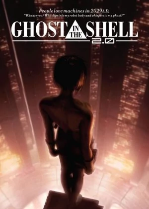
Kokaku Kidotai 2.0
It's been almost 15 years since Mamoru Oshii blessed the world with his adaptation of the Ghost in the Shell manga. A true anime milestone and a film that flared the hunger for anime in the West. For the 2.0 version Oshii revisited his masterpiece and granted it a little polish job. Question is, did he kill off his own masterpiece or was he actually able to improve on it?

Touching a classic is always dangerous. Just ask Ridley Scott or George Lucas. You're bound to piss of some angry fanboys who consider the film more than a simple film but a relic of its time. On the other hand, you might reach a new audience which doesn't really feel the need to try out the films of yonder. Sound and color touch-ups are usually quite harmless, but Oshii also decided to redo some sequences to connect it closer to the second film.
Ghost in the Shell was my favorite film ever for a long, long time. When I first saw it, I was quite blown away with the structure and lack of narrative urgency. My favorite scene has always been the long trek through the city in the middle of the film. Five minutes of good solid atmosphere to lose yourself in. But over the years some cracks appeared. Innocence was every bit as good as its predecessor and some scenes became a little murky and gray. So if done right, I wouldn't really mind the new paint job.

Visually some important changes were made. The most obvious one is the switch from green overtones (the wireframe views and intro) to sepia, diminishing its imposed relation to The Matrix and tying it closer to Innocence. Apart from that, some extra CG scene were included, mostly in the beginning of the film. While the CG is nice enough, it's not the same quality as in Innocence and it doesn't always blend it too well. The whole new intro isn't really an improvement, the helicopter flight (with the shark-copter) on the other hands looks a lot nicer.
Some extra cleaning was done, making the colors more vivid and the city views more crisp. There's more detail in the backgrounds, enhancing the overall visual impression of the film. As for the audio, some of the effects were obviously redone, capturing more of the surrounding noises and giving more audio feedback of what's happening on screen. They even redid some of the voices, most notably the Puppet Master himself who received a more fitting voice. It's these neat little things that give the film a more polished feel.

Overall I would say that the polish job resulted in a draw. The CG is somewhat intrusive and doesn't always add anything new to the film, the smaller touch-ups hold more value but aren't really all that ground-breaking. For people new to the series, I believe 2.0 is probably the best place to start, as it gels better with Innocence and narrows the gap between both films just a little.
It was a while since I last watched Ghost in the Shell, but the film still feels like a dream. It's a collection of stellar scenes and passages, drenched in atmosphere and showcasing a level of maturity not often seen even in live action films. The 2.0 version is good and a worthy attempt to make it easier to appreciate for younger film fans. Older fans might be a little disappointed by the lack of ground-breaking changes, but shouldn't fear a demolished masterpiece. Oshii did quite well.
