nesting links
One of the few workable updates html5 has to offer right now are block level links. In short, when using html5 just about every element can be nested inside a link tag, solving the problem of linking bigger areas constructed from divs, headings and/or other block level elements. A cool new feature that is supposed to make linking a whole lot easier. At least, that's the theory.

Like all things html and css related: read about it and be happy, try it and be disappointed. While the block level link does work in simple cases, it completely screws up when things get a bit more complex. For the current redesign of my blog I had hoped to put each shortlist article inside a block level link but after the first preliminary experiments I quickly put that idea behind me. Here's why.
web design and analogies: vomit bugs
Not too long ago I stumbled upon an article describing the vomit bug, a family of bugs causing the dom to scatter in all different directions, except the one you laid out initially. From what I have read so far it's related to the packet boundary bug (nesting of block elements inside inline elements I believe?) and occurs when nesting html5 elements inside a link. Looking at the resulting doms, the name is quite aptly chosen.
The problem that I'm experiencing occurs when nesting links inside other links. This used to be somewhat pointless, but now that we have block level links there are cases where this is actually quite natural. If you take the example of my shortlist articles you'll see I have a direct link to the comments section of the article, apart from that it could be that links are present in the intro text of the article itself. I assumed that these nested links would simply work as expected, as they lie on a "higher plane". The rest of the article element should react as being the block level link.
The resuls ... dom vomit, and not only in Firefox 3.6.
doms say more than a thousand words
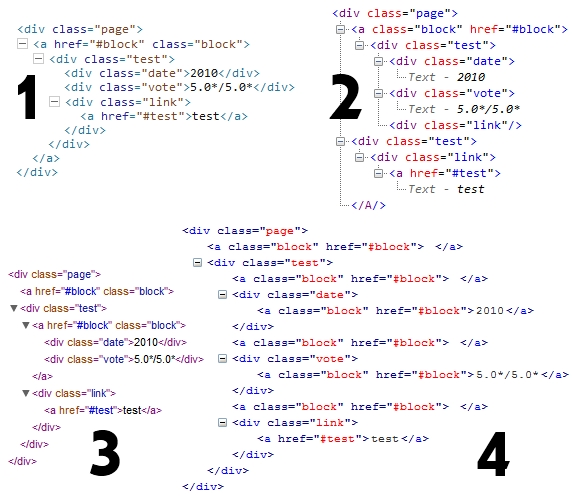
Rather than describe the problem, why not show it to you? The following html code was used to generate dom structures in a range of modern browsers:
<div class="page"> <a href="#block" class="block"> <div class="test"> <div class="date">2010</div> <div class="vote">5.0*/5.0*</div> <div class="link"><a href="#test">test</a></div> </div> </a> </div> As you can see, a very simple setup with a block level link containing several other block element and one nested link. Remove the nested link and everything is fine, but leave it there and all hell breaks loose. What follows is a screenshot of doms taken with dom inspectors in Opera 10.5 (1), IE8 (2), Safari 4 (3) and Firefox 3.6 (4):

The only one showing the dom correctly is Opera 10.5, though it must be noted that when giving a background color to the block level link Opera's rendering is off. Surprisingly, the only one rendering the block level link correctly is IE6 (seriously!), though the click area still doesn't correspond with the whole block level link. In short, block level links with other links nested inside are not working yet.
Those of you who've been following my blog a little longer will know this article fits right in with my articles on inner link spacing and cross browser underlining. All of these display wildly different behavior/interpretations of simple concepts across multiple browsers.
more about read more
Apart from this nasty bug, there is one other thing that caught my eye. When using block level links it's probably best to add a title to the link describing its function, as the content is not simple text but could be a whole content type. At the same time, block level links take away the need for multiple links leading to the same page, meaning that the omni-present read more link could finally be rendered obsolete.
When I tried to remove it though, I found that you lose a lot of visible, immediately recognizable feedback on the element telling you there is actually more to read. So while the read more link isn't exactly needed anymore, a "read more" indication could still be useful after all. Maybe just on hover with a little css3 animation, but definitely something to look into.
conclusion
My conclusion isn't any different from most conclusions found in articles about new html and css techniques. Cool stuff, but it's just not working yet. For simple wrappings without html5 elements and links block level links seem to work, but when you nest another link inside, it breaks down completely. Which is a shame really and I just hope it gets fixed soon. Up until that time you'll still need to use the links on the title and "read more" text or remove all links inside a block level link.